Stream of consciousness notes:
Tried going down the menu items by pressing S and it changed the game's color palette. Maybe you should have some on-screen controls, even if just for the first time booting the game.
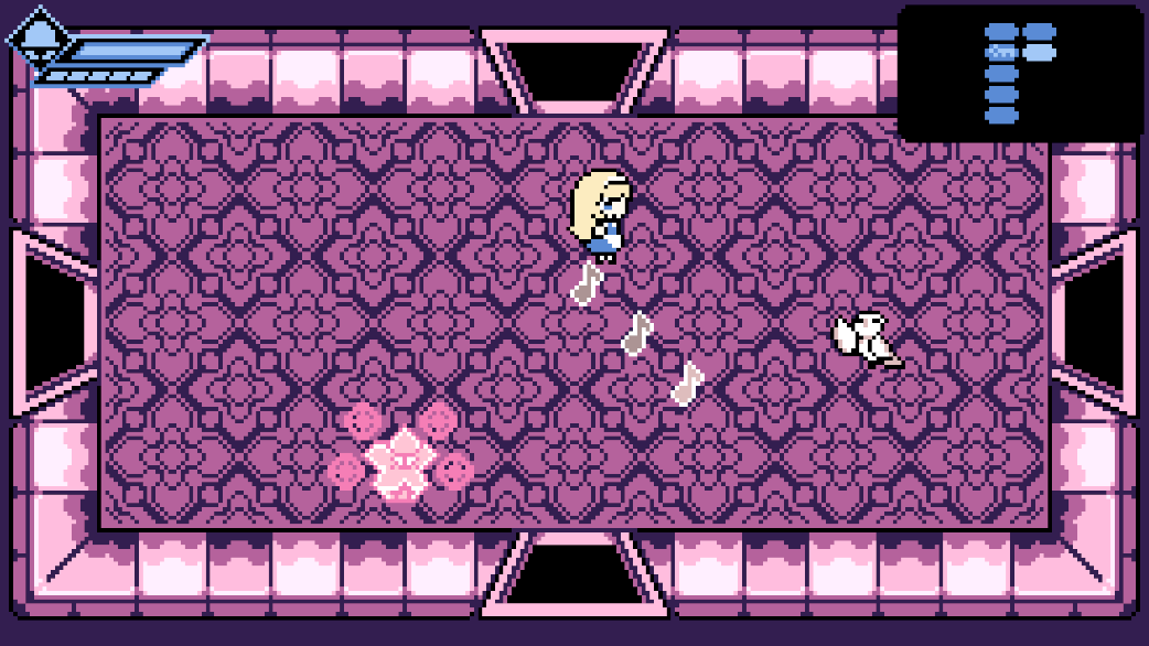
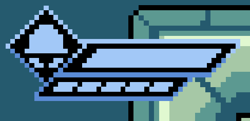
The health bar at the top left has some pretty low contrast, and the fact that the bar doesn't cover the entire "frame" is odd. It made me think that I would have a second health bar after the "top" one depleted. Why not do something like this?
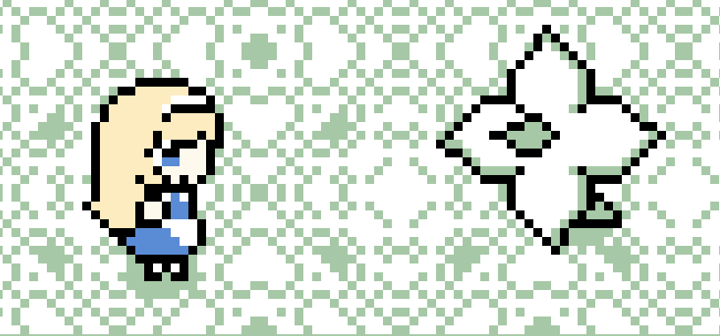
Contrast seems to be a recurring issue. This guy looks so similar to the floor, it's crazy. The projectiles from the enemy with wings are also extremely similar to the floor.
I'm getting into the swing of it, it's pretty fun. I'm not the biggest fan of the "select an upgrade from three random choices" design, but it's pretty common with the genre so I can't dock you for it.
I wish the game was more forgiving with enemy spawns. It's been twice now that I walk into a room with an enemy practically in the same position as me, and I instantly take contact damage.
I don't know how to feel about the inventory, I'm not a fan of pausing the action entirely to browse through consumables. It's cool that you have extra tools you can use and it follows that a game with a retro vibe would implement it like this, but I just don't like it.
I didn't get very far, just played for maybe 20-25 minutes. The art is cute and the gameplay knows what it is, so I don't have any real complaints.