
Indie game storeFree gamesFun gamesHorror games
Game developmentAssetsComics
SalesBundles
Jobs
TagsGame Engines

EmaceArt

86
Posts
17
Topics
130
Followers
146
Following
A member registered Sep 10, 2018 · View creator page →

Creator of

Recent community posts

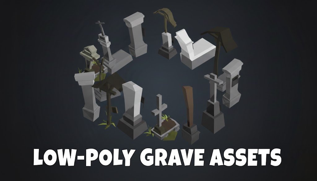
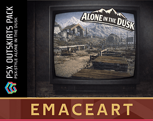
PS1 PSX Alone in the DUSK – environment asset kit by EmaceArt

Alone in the DUSK is a PSX-style environment asset kit inspired by the mood of Silent Hill, Alone in the Dark and Twin Peaks Movie. Below you’ll find a description of the location, the current technical state of the pack, and plans for its further development.

Introduction

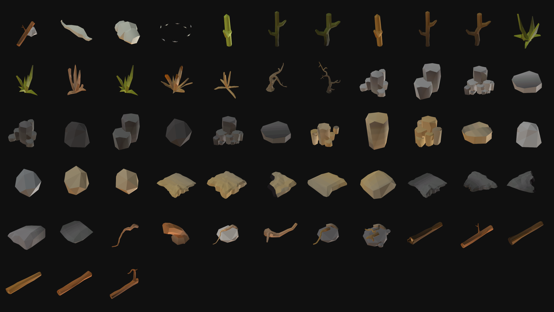
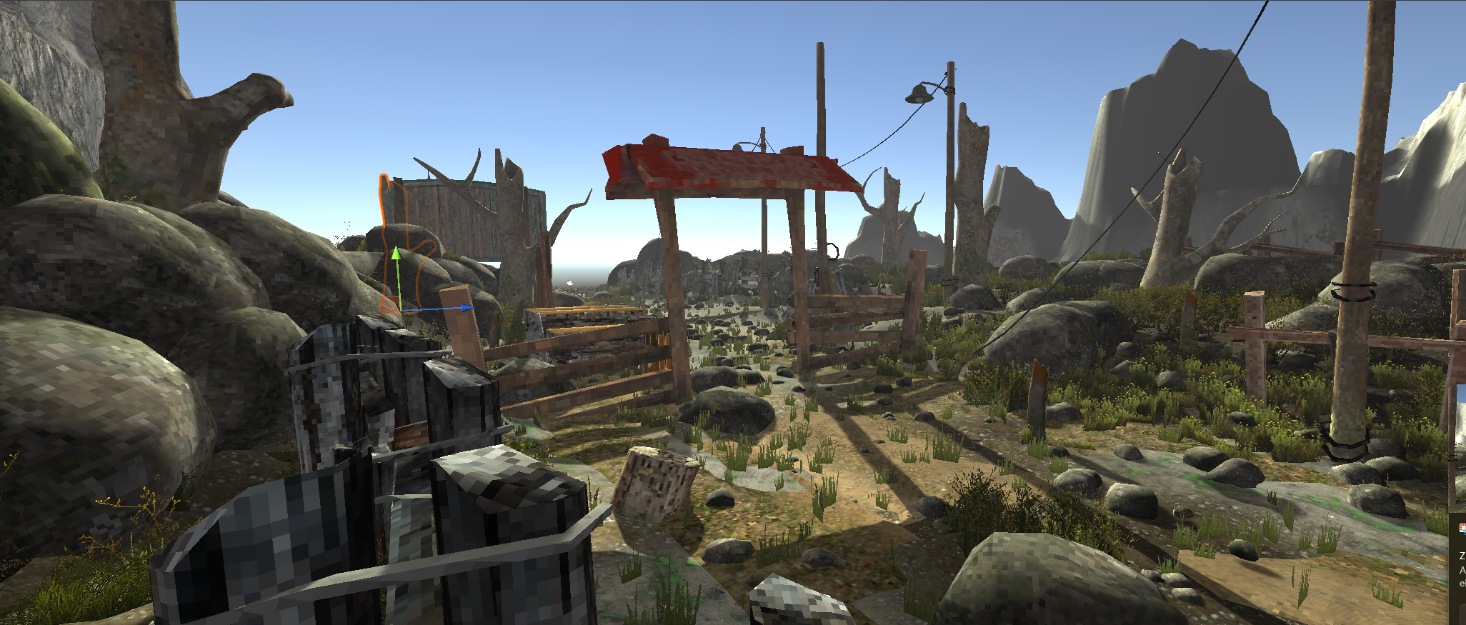
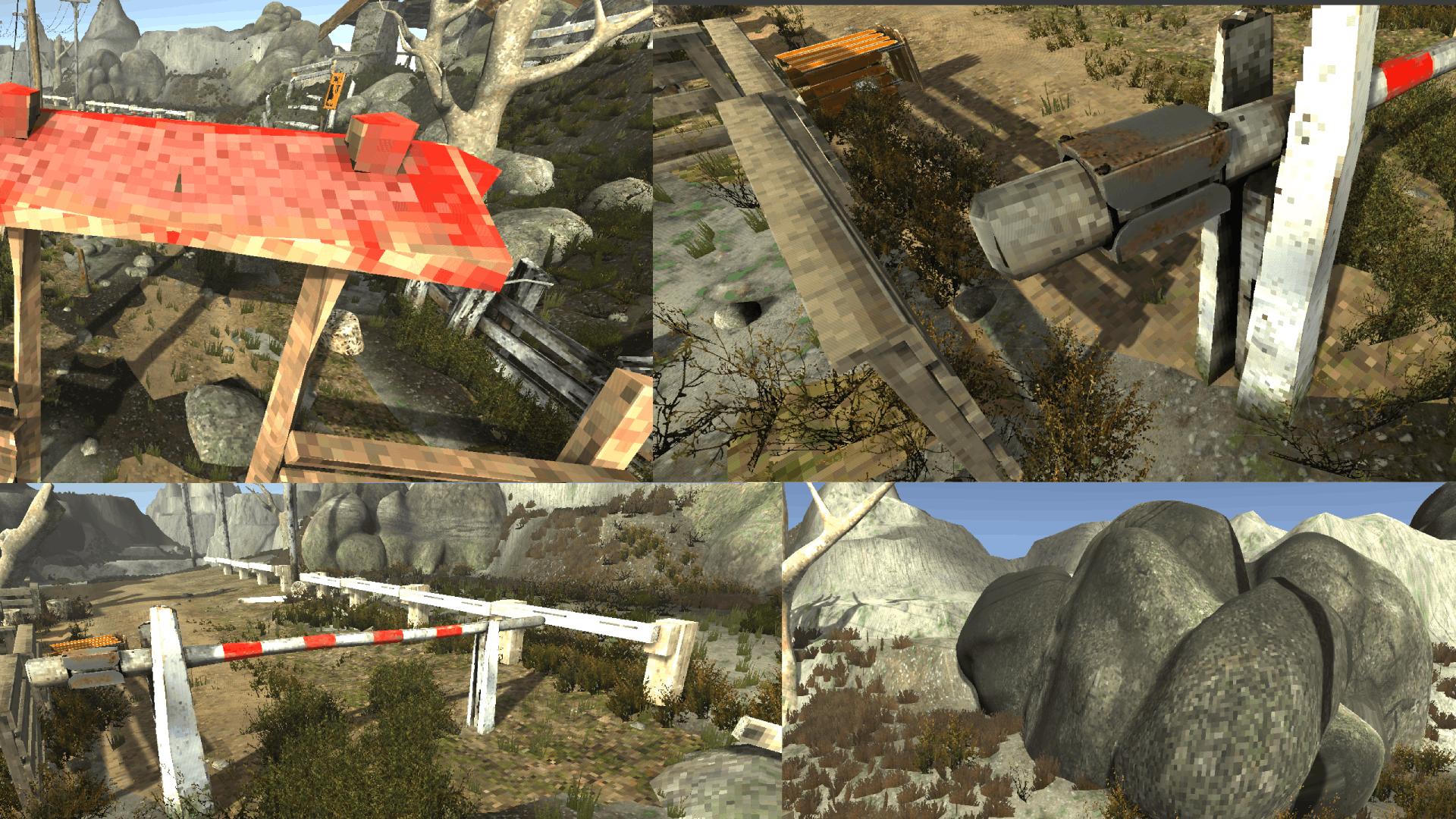
The location represents the outskirts of a town - a slightly hilly, tourist spot with a small bridge, benches, trash bins, guardrails and warning signs for visitors. It sits on the edge between nature and infrastructure: part scenic viewpoint for tourists, part unsettling road to nowhere.

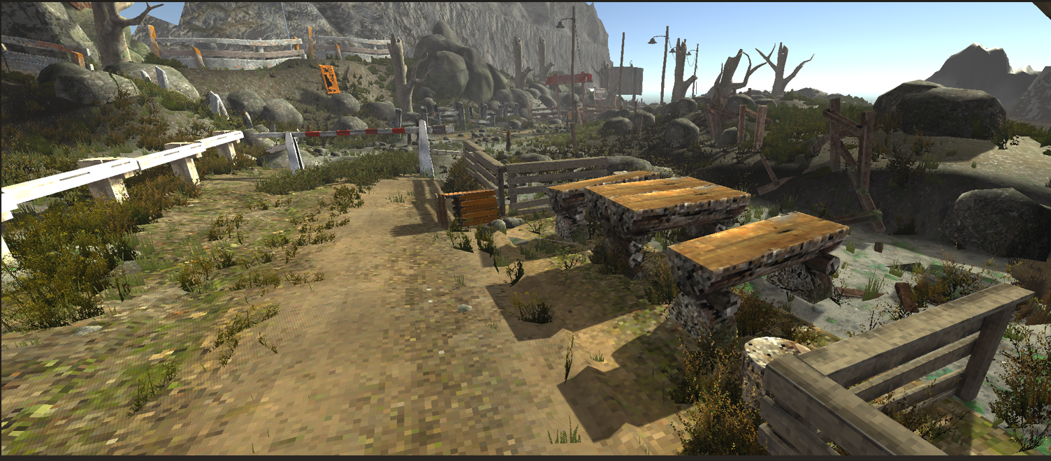
The current screenshots show the scene without final post-processing. You’re looking at raw Unity lighting, still without the target colour grading, PSX/CRT filters, final fog or a finished sky. This makes it easier to clearly see how the models, materials and composition work on their own.

What still needs improvement (technical)

At this stage there are two main pain points in the scene, both already broken down into concrete tasks:

Overexposed, overly bright props - the guardrails, posts and some signs have albedo values that are too high, so under the current lighting they start to glow like small lamps in the frame. This breaks the value balance and the readability hierarchy of the scene. To fix: lowering the albedo on these materials and doing another exposure pass.

Inconsistent texel density - different objects use different UV scales, so the “pixel size” jumps between meshes. The PSX style stops feeling unified and the scene looks like a collage of different sources. To fix: a UV / texture pass to unify texel density across assets and repair stretched UVs.

Shading artefacts on some meshes - the current normal and tangent setup creates overly smooth shading that clashes with the low-poly PSX look. A few props pick up weird light gradients and specular streaks. To fix: simplify the shading by hardening vertex normals, cleaning up tangents and reducing normal map influence so lighting reads flatter and more consistent across assets.

---------------------------

These issues are intentionally parked for a later focused pass, so that at this stage I can iterate quickly on layout and mood.

Roadmap for the pack

In the next iterations I plan to:

- UV / material pass: unify texel density and fix overbright materials on props - Shading pass: simplify shading by hardening vertex normals, cleaning up tangents and reducing normal map influence so lighting reads flatter and more PSX-like - Add post-processing: colour grading, PSX/CRT filter, and final fog and atmosphere for the location - Prepare ready-made scenes and prefabs so the asset kit can be dropped straight into a Unity project - Consider preparing a Godot version of the scenes if there is real interest in that

I’d really appreciate your feedback: how do you like the mood of this location and the overall direction of the pack so far? Let me know in the comments which elements work best for you, what you feel is missing, and what extra props or variants (for example different signs, more tourist-area details, support for a specific engine) would be most useful in your projects. Suggestions from the comments will help shape future updates of the asset kit.

Really solid modular set - the amount of parts for beards, hair, clothing and accessories is easily enough to build a full cast of NPCs or hero variants for one game. I really like the clean flat design combined with a comic-style cel shading; together with the simple palette and low triangle counts it makes for a very cool stylized base, also suitable for mobile.

Nice idea for an asset pack - framed wall art is the kind of micro-detail that very rarely shows up even in big environment bundles. I like that it’s a coherent set of small scenes that work as ready-made compositional “windows” in the background instead of just random textures. In 3D games these are great as controlled wall noise and for gently guiding the player’s eye through corridors and rooms. Packs like this are a perfect complement to larger environment sets. Big plus for including a Unity package and Blender files, makes it easier to tweak scale and pivots or create custom frame variants. The only thing I slightly miss is a few more frame shapes/aspect ratios (like long horizontal, more “map-like” pieces) to break up the wall rhythm in larger spaces.

Hi!

Sharing my freshly updated CosmoKit - Low Poly Planet Pack. It’s one of my most downloaded packs, so I gave it a proper refresh and I’m still putting it out there just out of pure love for spacey, low poly vibes. If you need a Sun, Moon and a bunch of colorful planets for a galaxy map, menu or a small space game, feel free to grab and use it.

👉 https://emaceart.itch.io/cosmokit-low-poly-planet-pack


I know quite a few people have already used this pack, so if these planets end up in your project, prototype or even just on a loading screen, I’d love to see a screenshot or a short clip.

(1 edit)

Hi everyone,

I've been working on some stylized environment workflows lately and just finished a modular Low Poly Cemetery Kit. I decided to release it for free to help out other devs working on horror or stylized projects.


I'm particularly curious about your thoughts on the optimization side. I’ve included 3 levels of LODs for all 50 meshes to make them viable for mobile and VR/AR, which can be a bit of a balancing act with this aesthetic.

Low Poly Cemetery Grave Kit with LODs by EmaceArt

A few technical details:

  • Optimization: Using a single texture atlas to keep draw calls low.
  • Compatibility: Included FBX, glTF, and .blend files alongside the Unity package.
  • Variety: 50 assets including broken graves, wooden crosses, and stone fences.

I'd love to hear how these perform in your engines or if there are specific props you feel are missing from typical graveyard sets.

If you're looking for some spooky assets for a jam or a prototype, you can grab them here: [Link do Twojego assetu]

Feedback is always welcome!

Wow, that has to be the highest level of compliment 😅 I’m really happy Harboria clicked with you, but I also hope you’ve got plenty of other good reasons to live. Thank you so much for the kind words and good luck with your project - may this harbor be just one of many cool places in your game.

Love the vibe here - it instantly brought back memories of Universe on the Amiga, that Core Design adventure from 1994. It has a similar “space opera road trip” feel where every location looks more like a sci-fi illustration than just a room to walk through. The pixel art is really strong: the palette feels cohesive, colors flow nicely across the different depth layers, and the silhouettes stay readable even when the screen gets busy. I really like how the backgrounds are a bit softer and more painterly, while the interactive elements are built from simpler shapes - that keeps the game playable and stops the visuals from overwhelming the player.

What sells it for me most is the scene composition: there’s usually one clear focal point, and the way architecture and props are laid out gently guides the eye towards it, so the screen feels rich but still very readable.

For a while I’ve had this idea in my head about things that used to move all the time and then simply got stuck in the desert. 

That turned into a small diorama-style “rest stop after the adventure” with a grounded raft and a bus cut in half. It’s all stylised, low poly and built in Blender + Unity, but I tried to give each asset a bit of its own story so the composition itself hints at what might have happened here.

The bus is sliced open and turned into something between a small home and a base camp. The raft feels like it once travelled down a big river that no longer exists - now it’s buried in sand, but there are still flags, paddles and scattered belongings around it, as if someone is about to come back. Nearby there’s a broken barrel with dried bones of some tiny creature. On the roof of the raft a lone seagull is sitting, probably the only living thing in sight. On the deck there’s a cooking pot over a long-dead campfire. The whole scene is basically a bunch of frozen moments arranged to guide the eye while staying light on the technical side.


If you want to actually step into the scene, I uploaded a Unity package with all the prefabs and the demo scene:


https://emaceart.itch.io/raft-on-the-desert


You can open it, fly around with the camera, hide stuff, move props and see how everything is put together. Lighting and atmosphere are already set up, so you can instantly build your own mini diorama on top of it - or completely tear it apart, change time of day, fog, contrast and mood, add your own props. I honestly didn’t spend a huge amount of time polishing this example scene, so I’m really curious to see what you can squeeze out of it.

And here’s a small, low-key challenge rather than a flashy contest: using this pack, create your own shot of this place. It can be a heavily reworked scene, a new camera angle, different lighting, whatever you like as long as it’s based on these assets. Post your screenshots (or a gif) as a reply to this devlog. From all entries I’ll pick one shot that surprises me the most in terms of composition or mood, and for that author I’ll rebuild this scene for their engine of choice and send them the project - for example for Godot or Roblox. So in short: you play with composition, light and layout, and as a prize I’ll take care of the engine-porting and technical work for you.

(1 edit)

Hi everyone. I’m not new here, but I’m getting seriously active now and I want to be genuinely present in the community.

I’m EmacEArt. I create 3D assets, mostly environments and level art, modular kits, and props. I’ve been in gamedev for about 15 years. More info is in my bio. If you have quick questions, drop them in this thread and I’ll gladly answer.

I really appreciate what people build on itch. There’s a lot of creativity here, especially in 2D. I have a strong soft spot for pixel art because I grew up on 8-bit games. I’ve worked with pixel art before, and I’d love to go deeper into it in the future. For context, Blind Shot on Steam was a focused, a few-month sprint I shipped with a friend. I was responsible for the entire visual side of the game: all graphics and animations (excluding code), the full UI from concept to final implementation, and also the game theme plus the core gameplay mechanic concept.

I’m now running a 3 to 4 month marathon until March. All my packs will go through an update cycle: Tech, MidArt, MegaArt, and a final Tech pass to lock things in. I’ll also release 8 new packs during the sprint. The first stage, the technical update, is already done for all packs almost 100%. I’m devlogging progress regularly. I’m now moving into stage two, MidArt.

One important note: my profile also has a lot of free packs, and every single one of them has received the technical update as well. I don’t want the free stuff to be neglected. I want it to be a properly maintained part of the library.

The most important thing for me is speed and matching real user needs, so I need prioritization. What’s a must-have, what blocks you, what saves the most time. Join my Discord. There will be a timelining section where you can directly influence what gets done first and where updates go next. If you’ve bought any of my packs, during this sprint you’re guaranteed support. I’m available daily and I take solid feedback seriously.

And one more key point: I’m moving into Godot support. I want to build a Godot-focused library and demo scenes with lighting and post-processing, so the packs look good right after import. I haven’t done this workflow before, so if you’re experienced with Godot and have practical tips, especially about importing, materials, lighting, workflow, and best practices, I’d really appreciate the help. Ideally in the timelining section so we can set priorities right away.

See you in the next episode.
ArtStation - EmacEArt !

I’d keep it simple like this: one “hard” socket per bone for all variants, sharing the same pivot and a small box collider. The add-ons using that socket would be grouped into just 2-3 size classes (small/medium/large) instead of perfectly matching every single part - a bit of mesh intersection is fine as long as nothing pops at gameplay camera distance. For colors I’d keep all sockets and brackets on a single neutral material (steel / grey plastic) and only let armor, covers and the main module shapes change colors. On top of that you can have a few fixed palette presets as a base, plus maybe a subtle tint control for one accent color so users can nudge the look towards their project without breaking your original schemes.

The system already feels like a mech-flavoured class creator. I’d push that idea by adding a second layer of small sockets for role-defining bits: extra shoulder and knee armor, backpacks/boosters, antennas, plus dedicated weapon mounts on upper arms/forearms. On top of that, 2-3 chassis frames: a light, tall-legged scout frame, a standard all-rounder, and a heavy base that could even work without legs - more like a mobile turret. On that heavy base the torso could turn into a cockpit block with cannons instead of arms, for a pure frontline or artillery role. I’d also treat color schemes as their own module: a few preset palettes and some example builds like “fast”, “heavy”, “support” that players can tweak, a bit like picking a class in an RPG but translated into your cool robot lineup.

Really love how clearly you laid all of this out. There’s something oddly comforting about reading someone else wrestle with timing and scope instead of just smashing the publish button the second the last asset is “kinda done”. I end up in that “ok, basically finished... but also not really” state way too often, so the way you’re framing the delay feels a lot more intentional than just a stumble. In that light, pushing things by a few days really does read like strategy.

I also really like the idea of the forest / graveyard set being the first chunk of the path, with the other locations growing out of it over 2026 instead of everything shouting for attention on day one. With the kind of folder structure you described, it’s easy to picture people just diving in, grabbing what fits their scenes and getting to work without digging through a mess of directories. And the lower pricing during sales sounds like it nudges folks toward experimenting rather than overthinking if it will “pay off”. Hopefully the bundle timing lines up, the algorithm is in a decent mood, and we start seeing these spaces pop up in all sorts of strange little horror projects here and there, instead of only living forever as a “nice collection in the editor”.

Hey, I really like how honest you are about both the scope and the delays - that’s something a lot of us can relate to. That mix of locations (forest, graveyard, isolated cabin, later maybe hospital or space station) is basically several separate biomes inside a single product, so the hardest part is probably going to be keeping a consistent style across all of that.

I work on horror environments myself and from experience it helps a lot to treat the first release as a tight core: a polished forest/graveyard combo with a few strong hero assets, and then add the other locations later as clearly labeled themed updates. It makes it easier for devs to understand what they’re actually getting, and it lets you keep quality and pace under control.

Nice work on putting out a free modular mech, that’s exactly the kind of thing that can become a “base character” people build around. As someone who ships environment and prop packs: a few things that really help modular characters feel production-ready.

(1 edit)

Appreciate you noticing that. It’s working now — you should see the purchase/download button.

Thanks!

  • These aren’t drawings. They’re live (real-time) renders using post-processing and lighting. Thank you!


  • Hey, welcome!

    “3D art” can mean a lot of things, so it will be much easier to help you if you share a bit more detail about your project. For example:

    - What game engine are you using (Unity, Unreal, Godot, something else)?

    - What kind of 3D art do you need most: environments, props, characters, UI, VFX?

    - What style are you aiming for (realistic, low poly, pixel-style 3D, stylized, etc.)?

    - Is this a paid collaboration, revenue share, or just a hobby project?

    From the screenshots of your profile you’re not doing anything “horribly wrong” - the models look solid, the PSX style reads clearly, and the PlayStation-style side bar on the covers gives you a nice, consistent identity. The main issue is how you present and communicate the packs. On the pump shotgun and double-barrel pages the description is already decent, but on the flamethrower and some single assets you only have one sentence like “After purchasing you will recieve a .glb file” and that’s it. For someone buying assets, the boring technical info is what sells: exactly how many models are in the pack, rough polycount, texture sizes and types, file formats (.glb, .blend, maybe .fbx), orientation/pivots. Add one clear line about the license: allowed in commercial games, jams, trailers, screenshots etc., not allowed to resell the raw files. And it’s worth fixing typos like “recieve” and “FlameThrover” - tiny thing, but it signals how much care went into the page.

    Second thing is previews. You have nice renders on a grey background, but I’d add at least one “in-game” shot: first-person view with hands, or just the weapon placed in a simple lit environment, plus one close-up and maybe a wireframe view. That boosts trust a lot, because people see how it behaves in a real scene. On some pages the text takes half the vertical space and the image is quite small on the side - you could crop tighter so the weapon fills more of the frame. Since you’re doing PSX, consider showing one shot with a stronger retro / dithering look so the vibe is instantly obvious.

    Last point: just uploading assets to itch usually isn’t enough to get attention. Every time you release something, post a short showcase on Twitter / Bluesky / Mastodon, drop it in relevant gamedev Discord channels, and write a tiny devlog on itch about how you made it. Use strong tags like “psx”, “retro 3d”, “low poly weapon”, “low poly gun”, “psx horror”. You can also bundle several of your weapons into a bigger “PSX Weapons Pack” and push that as the main product, with the single items as cheaper options. That usually catches the eye better than five separate pages with one item each. Long story short: your base work is good, you mainly need clearer information and a bit more context/screenshots, and your chances of getting attention should go up a lot.

    Thank you! Glad you like them. I already have a big update planned for this pack, focused on guiding the player along the world's paths in a more cohesive way - with a comprehensive set of pieces and clear landmarks. This is the first of several key updates I’m planning for the near future. I’ll post an update on the page as soon as it’s ready.

    Klimatyczny tytuł :)

    I’m a level/environment artist working in Unity, and I keep hitting the same wall: the more the world grows, the more time disappears into “technical housekeeping” instead of composition, set dressing, and art decisions.


    Which engine do you work in (Unity / Unreal / Godot / custom / other), and at what scale (small scenes vs open world)?

    So I started building small internal tools to reduce friction and keep projects navigable when scenes/packs get large. I’ll drop screenshots in the thread (easier than a wall of text), but here’s the current tool backlog in one breath:


    Prefab Researcher — fast prefab search/browsing so I’m not spelunking folders for half my life.
    Prefab Builder — batch prefab creation with consistent rules (folders/naming/colliders/LOD handling).
    LOD Generator / LOD Fixer — creates or repairs LODGroup structures and naming consistency.
    Hierarchy / Project Organizer — bulk sorting/cleanup to keep large packs/scenes readable.

    Now the part I actually care about: your workflow and pain points.
    If you’re a level/environment artist, can you share one short reply with:


  • 1 How you structure hierarchy / scene organization (your “default pattern”),
    2 The #1 thing that kills your flow (the frustration that keeps coming back),
    3 Any tools/patterns you rely on (built-in, marketplace, your own scripts, anything).


    I’m collecting real-world approaches from artists (not theory) to see what’s common across pipelines—and what’s worth tooling up next.

  • I’d also love to collect feedback on my Discord — that’s where I mostly discuss this stuff and where we’re building these level artist tools/assets together. https://discord.gg/q57hjZCB

    It makes me really happy to read that, thanks a lot for the comment! I like releasing free packs so more people can calmly test the style and play with them in their prototypes. This particular pack should get two more larger updates this month - some new pieces and overall polish - all as free updates. At the same time these releases help me gather honest feedback: what people enjoy, what they miss, and what the current needs and trends are in the dev scene, so I can plan future projects more thoughtfully.

    The atmosphere feels really unique, I rarely see assets in this kind of style. I’m really curious how you achieved the cel shading with those thick outlines - is it driven by the texture/material (like hand-painted edges), or is it some custom shader trick?

    Thx!

    Thanks!!

    A fresh pack of stylized, low poly alien flora with a volcanic vibe – perfect for lava caves, toxic lakes, crater zones, or magical biomes.

    Bold shapes and glowing contrasts make these plants stand out even at a distance, making them ideal for level decoration, visual guidance, and atmosphere building.

    What’s Inside:

    • 22 models (FBX, glTF + Unity prefabs)

    • Lightweight geometry (~6k tris / 5k polys / 3k verts)

    • Single texture setup (easy recoloring) + 3 materials: base, water, lava emission

    • LODs 1–3 for distance optimization and stable FPS

    • Unity Demo scene with post-processing profile – just drop in and go

    • Blender Demo scene

      👉 Get it here

    Perfect for:

    Lava levels, alien caves, volcanic worlds, sci-fi or fantasy environments — basically anywhere you need a punch of stylized atmosphere without sacrificing performance.

    This is such a smart take on PSX style - instead of generic rocks and crates you went straight for a very specific narrative space. The amount of destroyed variants is perfect for storytelling: you can build a calm campsite, then gradually push it into horror just by swapping meshes and textures. As someone who also builds environment kits, I really like how each asset belongs to a clear category (sleeping, shelter, fire), which makes it easier to design gameplay beats around them. If you ever expand this, a handful of larger structural pieces - broken cabins, twisted trees, maybe a partially collapsed parking area - would give level designers a few strong anchors to compose around.

    Love how focused this pack is on functional chunks instead of random sci-fi clutter. Buildings, paths, domes, defenses - it’s basically a ready-made kit for blocking out a small base and then pushing it straight to production.

    Your swamp scene has a really solid sense of depth - the way the silhouettes of the trees layer into the fog makes it feel like a playable space, not just a beauty shot. great portfolio piece and super inspiring for people building stylised environments in Unity/UE.

    Really nice building block, that staggered roof instantly feels like a slice of a real Tokyo street. I also like how you keep everything in a calm grey value range, so the windows and railings read clearly and don’t fight with the roof tiles. If you make more variants, a bit of rhythm-breaking - different curtains in a few windows, AC units, a shop sign or some laundry on a balcony - can do a great job hiding the modular repetition in game.

    The story you describe in the post is almost a one-to-one with mine - I also spent years doing client work and a “normal” job, building environments on the side. For the last five years I’ve been saving up and preparing so I can finally try to chase the same dream: becoming a full-time asset publisher and making a living by helping other devs build their worlds. 

    Your video does a great job showing how much the same forest changes character between presets - from a calm night, through full “Silent Hill vibes”, all the way to dirty, unsettling horror. It really feels like an actual level, not just a bundle of trees; the lighting and forest density clearly guide the player. I really respect that you included a full Unreal project and that you’re using this as a way to reconnect with your own ideas. For someone like me, who’s just about to try the same path, it’s super motivating - good luck with the next packs, I’ll be following along.

    Nice update - just adding a proper demo scene can make a huge difference for people who grab a pack “last minute” for game jams.

    Hey folks,
    I’ve just turned my “Polyvania” 3D asset pack from paid to 100% free on itch.io – with no content cut out. It’s exactly the same full version previous paid users got.


    It’s a stylized low/mid-poly pack for vampiric, cartoonish town environments, inspired by the vibe of Hotel Transylvania. Inside you’ll find for example:

    • modular streets, sidewalks and small plazas,

    • lots of house variants to quickly build whole districts,

    • props and details for an immersive, slightly absurd vampire atmosphere (easter eggs, quirky references, exaggerated shapes),

    • ready-made scenes and modular level chunks so you can move from blockout to a playable level much faster.

    Page link:
    ITCH: https://emaceart.itch.io/polyvania
    AssetStore: FREE LowPoly Town Massive Cartoon Pack - Vampiric PolyVania | 3D Urban | Unity Asset Store

    You’re welcome to use it in:

    • commercial and non-commercial games,

    • game jams,

    • prototypes, trailers, devlogs and screenshots.

    The only thing I ask is please don’t re-upload the raw assets as your own pack.
    If you end up using Polyvania in a project, I’d love to see screenshots or short gameplay clips. 🙂

    that mindset of “making things I’d like to use myself” is really good, and usually pays off in the long run. 😊 This pack already feels like something you can build a full scene with, and that’s a huge step up from just having a bag of loose props.

    As someone who also sells stylised asset packs, I really enjoy looking at this kind of work – you can feel that the tavern is meant as a complete “scene machine”, not just a bag of cool standalone props. I like how much attention you give to pivots and modular walls, because that’s exactly where a lot of first packs fall apart: everything looks nice on renders, but in an actual scene nothing wants to sit on the grid. 

    good luck ;)

    Really pleasant and cohesive set – love how you get such a cozy feel out of a few simple shapes.  The lamps and bench give a nice sense of scale so the whole floating tile feels like a ready-made chunk of level for dioramas

    Wow, awesome robots! 😍 I have a real soft spot for this kind of low-poly style – I’ve made two larger environment packs in a similar vibe, under the name FREE Epic Mobile. They’re just begging to be combined with your characters. That Epic Mobile pack is free on my profile, so if you ever look for an environment where a robot like this could feel at home, feel free to check my page – I’ve posted a few scenes there that could fit them nicely.