Also, space and enter are pretty awkward when also using the arrow keys to move. I would suggest making those two keys next to each other and character keys. Could be the following
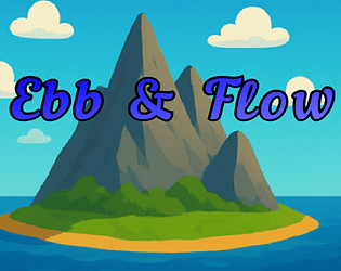
I love the direction with this game. It looks clean and the art style is nice!
The controls on the other hand are so bad :/ the keys don't always respond and when I release the key, the character continues to move for a little bit.
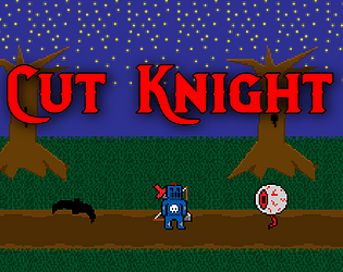
A little disappointing that we get a sword and shield and the first battle is just hopping on a rat that just goes left to right.
This game is cool though, fixing up the responsiveness of the controls is going to be crucial though!
Very unique game, can't say that I have played anything like this. The puzzles are too simple though, you can cheese pretty much all of the puzzles. This game also needs some chill music while doing the puzzles.
Alright, this is legitimately fun. I definitely enjoyed myself and thought it was good balance of hectic making me decide whether I want to be firing at the enemies or upgrade. I wish there was a way to increase my life though. The beginning can drag real hard though. I didn't realize till after my first game that there were skills to be gained, which made me want to play again with those new skills.
There is nothing to really go off of here. So far the gameplay seems to be stopping the bars from dropping to low on the beantto game. I put it in fast forward and didn't notice too much of a difference, and the time did not advance either. There was minimal to no interaction when pressing any of the beantto buttons. I think this game needs to have more interaction. Also, maybe sfx for interacting with the buttons?
First off, I really applaud the effort here. The game looks good so far and the assets used go well together. Everything for the most part works very well together.
Cycling through enemies to hit was very odd. There was a slime and a bat. While targeting the bat and pressing left to go to the slime, it went to Rose. Very disorienting.
The enemies on the overworld move incredibly fast, and once I realized that they gave no exp, that made each battle pretty annoying
The battle system as it stand right now is very slow. from clicking to attack and waiting for each thing to carry out took a little bit longer then what I would have wanted it to.
The overworld map is filled with buildings, none of which we can enter, so its a little confusing as to what makes something enterable or not.
I stopped playing once the screen stopped updating but I could hear the game was still processing my actions.
This happened during the big slime fight in the dungeon when trying to use the main characters buff spells. Not sure if that was the reason, or maybe cause I was going in and out of the window.
The fishing seemed weird just because the second you want a fish, you get a fish. The AFK fishing gets considerably less fish then if I was to just do it myself. Like I can either catch 60 fish, or 1 fish in a minute.
This is a really cool game. I don't believe I have ever played anything like this before.
The graphics are really awesome, and the music fits it perfectly. Really great on that.
I enjoyed setting up the traps as well, very satisfying to see Jason getting mauled by a bear.
That being said, I had NO idea on how to beat Jason in the end. I got him with the anchor, the bear, the water + electricity.
When looking at the starting map I saw that there was an X for where I started and wasn't sure if that meant it was trap or just where I started.
I also so another trap by the cemetery, as soon as I approached the cemetery the ghosts flew out of the ground and I tried to get Jason over while they flew out but gave up because it seemed impossible and I wasn't sure if that would hurt him. I proceeded to shoot every damn thing in that cemetery to see if I could get a reaction, but nothing. Not sure if it was suppose to be that difficult to figure it out, but I couldn't do it.
Its hard to tell just because this still feels like the beginning stages of building your game. I am really curious to see what the other weapons are going to feel like though.
As it stands, the combat is not very engaging. The enemies have one attack and I just dodge it and come back for another hit or two. then just repeat that sequence again.
The text that says S_CHRG: 0 is stretched out unlike the other UI elements, so it looks off.
The Health a poise UI bars are very lack luster and I had no idea what they were for a while.
The sizing of all the characters were pretty sporadic, felt like a Hodge podge of assets.
I hope to see this project come along further cause this could be cool!
This is a very interesting game! I love the art direction and how it seems like I'm manipulating 2d items in a 3d environment. The intro seems really cool and gets me curious what is going on in the story.
Physics were a little wonky with things moving at speeds I would not expect them to.
Objects moving right as I enter the room felt weird.
Getting items like the notebook page was difficult, I grabbed them, but it a little bit for them to enter my inventory.
It might be nice to have a little UI element for the items currently in your inventory.
turning the pages are a little frustrating cause they all just start flipping around.
maybe reset all items back to original spot upon returning?
I see now, I didn't realize there was really more to the game. The Meteorites phase lasted so long that I thought that was all that was gonna happen.
Let me throw out some ideas, take em or leave em.
Some kind of indicator for how long the phases are, cause it can get a little stagnant and not knowing how long it will last makes it hard to get through.
The first real enemy in the game, the bombs, end up going off screen a lot of the time.
It seems like the meteorites in the game are programmed to favor going just to the right hand side. I think it might be better if they were scattered just a bit more.
I think it would look pretty cool if when you pressed the left or right arrow key then the ship pitched like 7 to 15 degrees in that direction.
Just played again and I take back point 1 and 3. I can see now that I can make enough money for 1 upgrade even though they are so expensive. Also, I definitely see the green color now, don't know why I didn't register that.
I do not understand what the item is in the red meteorite. I get it and a sound effect happens and I can't shoot for like 1 to 2 seconds. I was assuming it was going to either change my attack or strengthen it, but it doesn't seem like it.
A couple of things that I think that can be improved.
1. Coloring the upgrades that can be afforded would be nice. I have to drag mouse over all of them to make sure I can afford them.
2. I have to do a lot of maneuvering with the upgrade screen because a lot of the time the price was just outside the window.
3. It seemed like there was a dramatic increase from the < $100 skills straight into the > $1000 skills, that stopped me from playing cause I didn't want to grind so much for incremental skills.

 Fun little game! Reminds me a lot of Super Smash Bros when attempting to launch the punching bag. Great job!